Does Your Logo Suck?
Yes, it really does. And so does your business. Well, at least that's what people might think based on first impressions if you haven't built your brand's visual identity using at least some sort of strategy.
As a kid, like many growing up in Canada, I had a love for hockey at an early age. Aside from learning to play the sport, I came to be fascinated with the National Hockey League (NHL). More specifically, the team crests on the jerseys. Even though we had a local NHL team at the time, I chose the Philadelphia Flyers as my favorite team purely because of the team logo and colors. It also helped that they had some pretty cool players on the team (like Pelle Lindburgh and Bobby Clarke), but after a while, my loyalty to the Flyers wavered.
This was mainly because my initial reason for liking the team had no real roots. I didn’t live there, I hadn’t traveled there, and I didn’t get to see them on TV very often unless they were playing a Canadian team on a Saturday night. There was nothing meaningful for me to latch onto—as it was based on aesthetics alone so it was purely superficial.
What this means is that the relationship between what your brand “looks” like and what your brand “feels” like can fall apart in two key ways. For example, many brands have great logos and visual expressions, but the value of the product or service falls apart behind it. Conversely, you can have a terrible logo, but your product or service and the brand sentiment behind it are amazing.
Now, if you fall in the first camp, visual identity isn’t going to fix your issues, so I suggest you consider something we call "Branding from the Inside Out". However, if you feel like your brand falls into the latter category, you’re in luck as you're not alone. There are so many bad logos out there that don't accurately represent how great the brand behind it really is, but with the right strategy and visual identity, this can be changed very quickly.
What makes a bad logo?
There can be many attributes that define a bad logo. The most common is just terrible design. Something done by an amateur designer. Maybe it's the nephew of a friend who learned to use Microsoft Paint. Structure and composition are poor, and sometimes creative liberties are taken in a very haphazard manner. Things just look ‘off’.
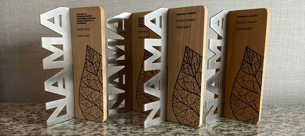
It takes many years to become good at designing logos. The problem is, as an inexperienced designer, you don't realize how bad your logo work is until you've done them for more than 10 years. You might think your design is good until you look back at it. Some designers, who are good at general graphic design, may never become good at logos. In my experience, designers who are great at structural design and have a knack for manipulating shapes can be great. But then they might need help from another designer to create the wordmark portion of the logo. Our most successful logo designs at Think Shift were collaborations with multiple designers and art directors combining forces to create a logo that is solid from all angles.
Define your narrative first
If you have a deep story to tell customers about your brand, this should be put on paper. Some sort of narrative that speaks to the customer and why they should care about you. This is really the foundation for your brand and will guide further steps on how to express your brand to the customer.
Consider meaning in your logo
Usually, it’s good practice to create meaning behind your logo. Something to rationalize all the design choices you’ve made. Decisions that can shape the personality. It's not a rule, per se, but a way to solidify the strategy behind the design. People think the strategy starts with questions like "what colour should it be?", or "do I want my logo to be a lion or a tiger?". It's much deeper than that, or at least it should be.
For instances where the logo is just a wordmark, it’s a little more difficult to create meaning. You may limit yourself to just picking a font, which isn’t a great solution. Instead, create a custom font or at least modify an existing font to become unique. Play with some of the shapes in letterforms to tell a story. With that said, your logo could have zero hidden meaning behind it and that’s ok too. Just be intentional about it. It’s up to the audience to decide if they care. If it’s designed well, it will get noticed for the right reasons.
Think about Nike’s ‘swoosh’. It’s one of the most recognizable logos and icons in the world. It’s so simple, but it conveys energy and speed in such a unique way. The main strategy behind the iconic swoosh was mostly related to the application. They wanted a logo that fits well onto the side of a shoe, had energy to it, and looked different from their primary competitor at the time – Adidas.
Logo or visual identity?
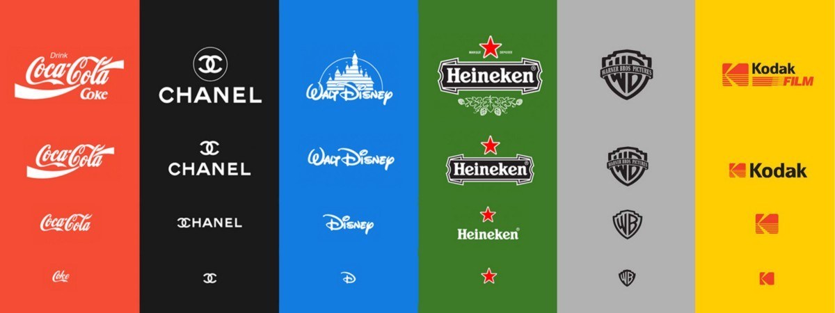
People might think that this is the same thing. Although they’re related, a logo is actually a symbol that is part of a brand’s overall visual identity. Visual identity includes anything used to express the brand in a visual manner. The colors, typography, photography style, and logo, are all parts of the visual identity. There may also be other things included like graphic elements, icons, or anything that helps convey the visual expression. Think about the McDonald’s logo – it’s not just the M that makes it recognizable. The yellow arches on red take it a step further. Brands can even use audio or sound FX as part of their brand’s identity/expression to help build equity in the minds of customers (think Duracell). Some brands have even created distinct scents as part of their identity. If you have ever walked into a Hollister or Westin you’ll have experienced this.
Simplicity and flexibility
We’ve all probably noticed graphic design trends take a shift over the past 8 to 10 years to simplicity. It feels like brands are going retro in a digital world, but (in reality) they’re becoming more modern. If you look back to analog reproduction methods, you come to realize why the good logos were simplistic and timeless in their nature; they didn’t have the flexibility to create complicated designs without reproduction costs going through the roof.
With the advent of digital printing, the number of colours used has no limit. We now have the option to use colour to its maximum, but that doesn’t mean we should. No longer are brands using logos with a ton of colours or depth like they started to in web 2.0. Designers are now using limited color and leveraging modern typography inspired by timeless type designs (like a traditional sans-serif).
Simplicity can also create flexibility. In a multi-platform world, the ability for your logo to adapt is more important than ever. With the introduction of mobile devices (smartphones and tablets), logos had to fit into different formats and "respond" to the device size and orientation. Responsive design is no longer reserved for only apps and websites, but logos too. Keeping it simple allows you to do this in a more efficient and seamless way. It will help keep the visual expression of a brand consistent across all touchpoints.
Now you’re probably going to look at your logo and ask yourself “does it suck?” Chances are you won’t have that sentiment, but you may realize that it’s not very relevant or authentic to the brand story, or not different enough from your competitors. Maybe it wasn’t designed to be timeless, so it could need a refresh to feel more modern. You may also be starting out with an entirely new brand for a product or a service.
Whatever the problem might be, it's worth considering a well-thought-out brand strategy before you even think about your logo. Your future self (and your brand) will thank you.
About the Writer
Rick Sellar – Creative Director
As Think Shift’s Creative Director, Rick brings strong leadership and a wide range of skillsets to every project he touches. Over 17 years of experience in the industry has earned him the privilege of working with brands like Jaguar, Cadillac and LEGO, to name a few.
Up Next