How to Design for Agriculture
I’ve been designing creative marketing specifically for the agriculture industry and its various audiences for over six years now, and I’ve come to find that designing for agriculture is no easy task. There’s a very specific kind of person you’re trying to reach and a refined formula for resonating with this audience.
Educated and trained in graphic design, I understand the guiding principles of quality design and effective communication through visuals and messaging. However, when I started at Think Shift, I had limited experience designing for agriculture, and an even more limited perspective on farming. Right out of the gate, I learned there are many sensitivities when it comes to agriculture marketing, or “agrimarketing”, as well as many tried and true methods to tap into.
Imagery
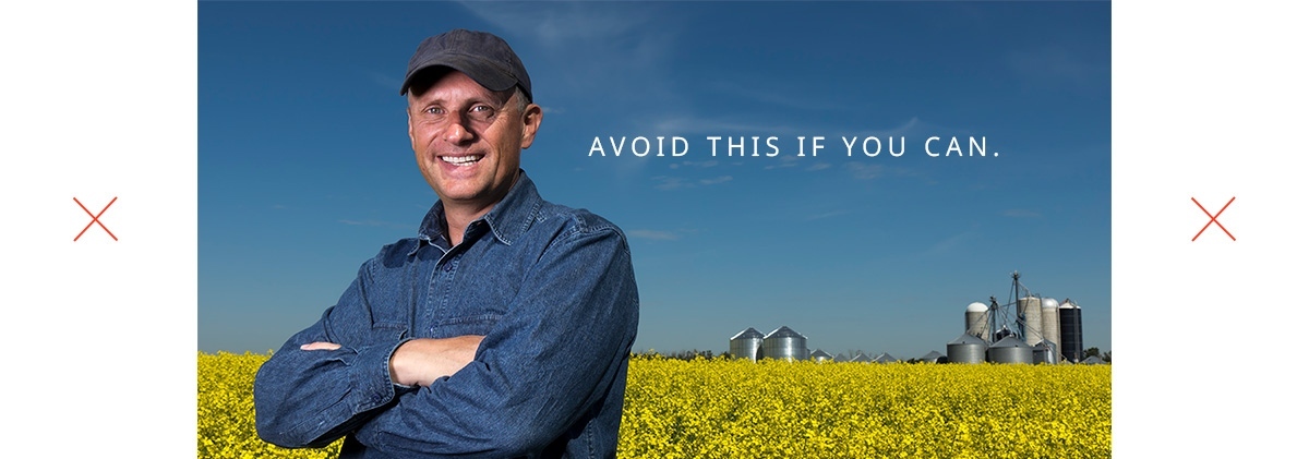
When your project is limited to stock imagery, there’s a small collection of appropriate agriculture-themed images you can find on the internet for a reasonable price. Luckily, many of these fit the ‘farmer’ persona: Postured-up, wearing a plaid shirt with some work gloves (arms crossed), standing in their field with a look of accomplishment on their face, as though they just grew the best crop they possibly could. Just like a proud father looks when their son scores his first goal in Timbits hockey. This is how all farmers look, so it’s probably a safe bet to grab one of those images for your design.
Then, there’s the crop itself. Canola grown in one field in eastern Manitoba looks exactly the same as canola grown in Western Manitoba, so I’d say just find an image of a canola. Or better yet, maybe the stock farmer image you already found has them standing in a field of yellow flowers – perfect!
Color
Everyone has an affinity for certain colors, but farmers are used to seeing earth tones in the field. Brown and green colors are symbols of nutrient-dense soil, plant growth and all things natural. An ideal harmony of color for agriculture, it just makes sense to incorporate these into your design.
Typography
Being hardworking, salt-of-the-earth folks, farmers prefer a traditional, no-nonsense serifed font. Think Courier New, Times New Roman… okay, by now, you’ve hopefully realized that I’m using a sarcastic tone.
Everything I have mentioned above (though it can be true in some circumstances) are not part of some “Design for Agriculture” formula. That’s because there is no formula that can be applied repeatedly to achieve a consistent, positive outcome in the ag space. Sure, there are some core design principles that can guide effective communication, but there’s “no secret sauce” for engaging with farmers and other ag audiences.
The problem with industry specific-marketing is that we all make the same (false) assumptions time and time again. Just like the assumption that all boys like the color blue and all girls like the color pink, not all farmers wear plaid, and not all farmers read the newspaper. Simply put, all people are different and are therefore attracted to different things. The industry a person works in does not necessarily define what resonates with them.
Unfortunately, a lot of marketing in agriculture operates on this assumption, and thus looks very much the same. You can take a print ad from the Western Producer, slap a different logo on it, and most likely no one would know any different. For this reason, many brands in this space are interchangeable. This holds true for many industries, but especially the more traditional ones like agriculture. A brand color may be the only differentiator that one may notice, and even then, that brand has to have a lot of equity to stand out (think John Deere Green in the equipment space). Doing something in marketing that goes against the grain (pun intended) can for sure stand out in the market – but is it effective? Will it achieve a business goal? Maybe… but maybe not.
Normal is what normal does
Here’s what I’m getting at: good creative marketing is strategic. It is carefully considered for the results its intended to produce. With today’s increasing growth in technology, hyper-targeted marketing is more viable than ever. You can tailor a specific message and visual to a specific person or group of individuals. Colors like hot pink and fluorescent yellow might actually work. An image of an astronaut in a wheat field might work too — who knows! Just watch out for normal. Normal can become white noise for an entire industry. There’s a propensity to have ag marketing look familiar, not realizing that familiar is playing it safe because it comes from a place of comfort. You’ll have to do something out of the norm to stand out.
Be conscious of details
This is where design for agriculture really matters. The details of an image and a message are paramount. Like any industry, your message is only as strong as its truth. If you have an ad for a canola brand, the image of the crop better be accurate: many have shown what they think is canola, but it’s actually mustard. And don’t fall into the trap of thinking an air-seeder is a combine. Everything must be spot on or your marketing becomes weak and imposturous. At Think Shift, we have Agriculture Training for anyone who touches client work in order for our employees to provide the best quality content that’s authentic to our client’s objectives.
Don’t settle for what the stereotypical farmer would like, or for what your client thinks their customer would like. Let’s widen the lens. Let’s create things that challenge these assumptions and push the current perspectives on agriculture marketing. Give your creative a fighting chance by pushing the envelope and personalizing your creative to suit your audience’s actual wants and needs — not what you think they want and need. Farmers aren’t drones, or robots, so stop taking a rinse-and-repeat approach to agrimarketing expecting an increase in results.
So, don’t design for agriculture. Don’t design for farmers. Design for… humans. Humans that just happen to be farmers.
Up Next